

by Jacob Hicks
Jamie Adams creates metaphysical realms of collapsed time and indeterminate gravity punctuated by acidic color and sexuality. He weaves classicism, the old masters, old Hollywood, disco, nature, and modernism into floating, lucid, beautiful dreamscapes. I have admired his work since I first ran across it. I was lucky to engage him in the conversation that follows.
JH: Where are you in relation to your image? Are you omnipresent-is the whole image you? Are you nowhere within?
JA: I think images created are ultimately more about the artist than the image represented. I see my work as psychic portraits or representations of an interior life regardless of the subject. This is not to say that they mirror the artist completely. In fact, it is a rather imperfect form of expression like any other; sometimes awkward, frequently revelatory. My relationship with my work is often conflicted. I don’t know that I ever consider my works to be finished. I suppose they can be viewed as either some kind of private entertainment or public confession. It’s what motivates me to continue making.
JH: If you were a character in the space of one of your own paintings
a.) where would you be…
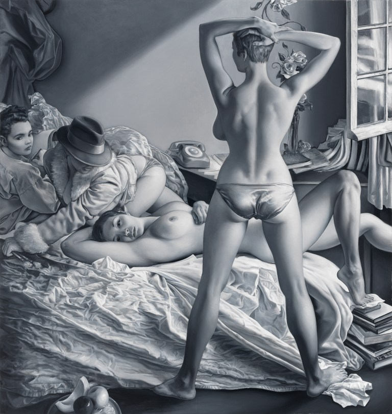
JA: I construct spaces that I wish to inhabit and explore. They are often reminiscent of places I have been or imagined in a dream. To give an example, in 2005 I was drawn to Jean Seberg’s bedroom apartment in Jean Luc Godard’s film Breathless. What piqued my interest was how it seemed inaccessible, remote, yet strangely familiar. I imagined its quality of ambient, north-facing light in this filmic space to be a suitable space for a painter’s studio. Creating the jeannie series of paintings was the outcome, the project lasted seven years from 2005-2012. Currently I am working on a group of paintings I am calling “Blondie Bubba”. The impetus for the work is to re-imagine different scenarios from my father’s youth. I want to preserve what has been lost.
b.) who would you be if not you, if you were maybe under the mask by Marilyn or a beautiful black body, or a Titian-esque statue
JA: I empathize with the characters in my paintings. My relationship to them—either viewing them as self or other can fluctuate over time. As a result they often develop with a certain amount of fluidity. The paintings generally go through multiple iterations, even when I have made preliminary sketches. The narrative reveals itself within the process of making as the characters reveal themselves to me — almost like auditioning actors for a play, the characters morph and change, sometimes playing a kind of masquerade in order to find the appropriate role. I am interested in portraying characters in a state of flux or an indeterminate state of being. I think it has to do with my interest in conveying a certain kind of psychic dimension and complexity, but I will leave that to the viewer to decide.
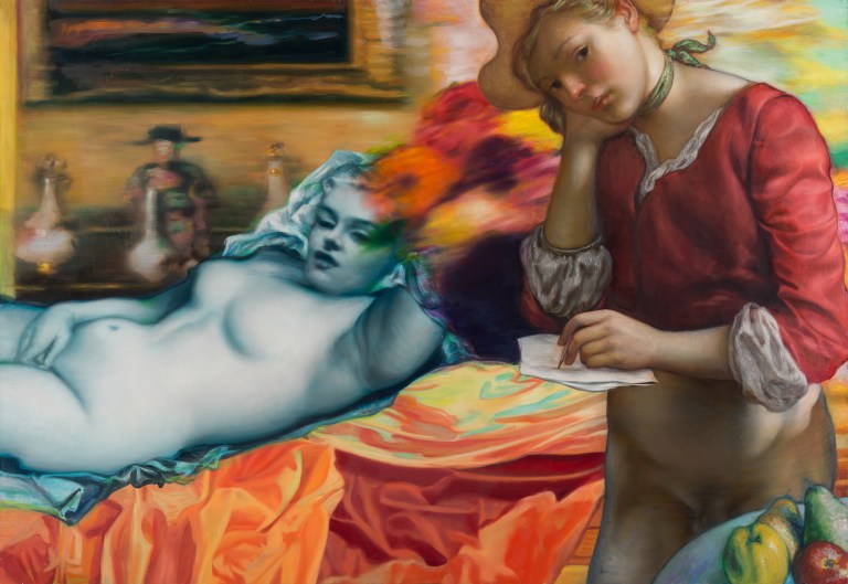
JH: Titian, Giorgione- I see a lot of Venetian influence-what else-Psychedelic 60’s, melodrama Hollywood 50’s, hip hop, pop culture, internet post-modern floating, deeply understood indirect painting. Tell me what I’m missing-the meat of your work-the reason for making…
JA: I grew up disco dancing, singing in quartets, and singing in musicals, so whatever flamboyance or theatricality one might find in my work emanates from that place I suppose. The Italians come into my sightline most recently. I have been teaching a summer in Florence drawing course now with a colleague and friend Buzz Spector via Washington University in St. Louis where we work as faculty. Seeing the massive Tintoretto’s at the Scuola di san Rocco remind me of Lucas films…and simple things like the slave’s ribcage at the center of “Miracle of the Slave” has captivated me since I was a boy.
JH: Who is a contemporary painter you love the work of?
JA: Lisa Yuskavage’s work was featured earlier this year at the Contemporary Art Museum here in St. Louis. I always read her work as more of a provocation, something like a collision between Precious Moments or Pixar and Penthouse. But after hearing her talk about her work, I understood them much differently. I read them as coming much more from a place of vulnerability as well as protest. They reveal trace of a former self that I was not immediately appreciating. They quite moving when viewed through the lens of life as an accumulation of experience. Formally, I think she is a marvelous colorist. Her images have a strong coherency of light, a color clarity. They remind me of Tiepolo’s quartet at the Chicago Institute. Her frequent use of green light is curious to me. It reminds me of an important aspect to making paintings today. It’s useful, maybe even critical, for the painter to set up certain challenges. It’s one way to find new territory. Brilliant greens everyone knows are difficult to manage. They easily can become overbearing. It makes me think of things soaking in formaldehyde like Jenny Saville figures (interesting in their conversation with late Renoir…) or Kim Keever dreamscapes (which I love)…but Lisa keeps even this so pleasant and visually enriching, where color passages meander through a range of warms and cools. Her recent piece “Triptych” (2011) I think is a great example of this on a grand scale.
JH: Do you think Picasso’s vision has been surpassed-he is our time’s Giotto, so who will be the future’s Picasso?
JA: Philip Guston is someone I look to. He appropriates from both of these artists and across many genres, and creates profoundly disquieting new form in his late period that is still relevant to contemporary issues–political, social, human. I will say that Giotto’s masterful frescoes at the Scrovegni Chapel still speak to this contemporary viewer. I had occasion to visit Padua and see it again this summer. His visualization of hell is terrifying, and the use of mixed spatial systems are incredibly inventive conceptions of the co-existence of temporal and eternal realities. He certainly serves as an important bridge between a more austere Byzantine aesthetic and the grandeur of the Renaissance as a humanist project. I am most attracted though to Masaccio’s work at the Brancacci Chapel—the cinematic narrative of Tribute Money, his awkwardly beasty bodies in the Expulsion and Baptism panels. I think Picasso certainly saw this work and assimilated its form in many of his blue period paintings, one being the couple portrayed in “La Vie”.
JH: What are computer’s doing to our thoughts and visions as artists?
JA: Probably like most people I have a love-hate relationship to many of the new technologies. The digital world is collapsing histories, and the smartphone gives me access even more easily, but I am finding it incredibly distracting in the end. In the past I admit that I have enjoyed watching television for cheesy sit-coms, infotainment and sports—light hearted stuff, but most of it today is simply mind numbing. Our kids rely a great deal on Snapchat and texting to communicate. It’s a great form of communication for it’s speed and efficiency. But like any other form of communication, it has its limitations, and is sorely lacking if used exclusively.….It’s been quite unavoidable for any of us to not be affected by so much of this–the proliferation of ‘screened’ imagery given the power of cinema, the ubiquity of the smartphone camera, etc… For myself it remains quite paradoxical–equally a problem as much as a solution when you think about how you experience life through so many mediated forms…and this is one of the reasons why I utilize collage and allow certain disparities to exist in the work. The use of visual tropes via film, lens, or print matter to construct my narratives are useful in this way.
I suspect with the advent of the camera people probably lost a great deal of their capacity to visually remember things because the picture could do it for them. With digital media becoming even more pervasive language becomes marginalized, and any expression, as Norman Bryson states, can easily seem after-the-fact. So it’s important to find a balance. There is evidence that typing on a laptop keypad for instance is not as effective as actually taking hand written notes for students in the classroom. You can type faster on the computer, access more information, and so on, but comprehension and the ability to utilize information is less. This is where media forms such as drawing and painting, embodying the trace of touch and sensual materiality, seem suitable conveyers of human experience, desire and loss.
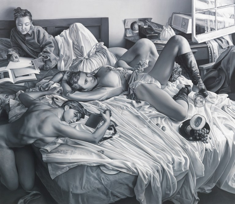
JH: Do you ever work from life or all of your images sourced from other 2-d images?
JA: I generally use whatever visual information seems necessary at the time…. I often stage still life props or clothing on a mannequin. Lately, I’ve been working more from memory, as well as developing a more elaborate diorama of characters to work from. Regardless of the source material I think it’s important to leave the references behind and develop the painting on its own terms. It’s my accommodation to wanting to experience and remember things more directly.
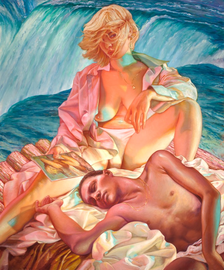
JH: What do waterfalls mean to you-their metaphor you can’t and don’t resist?
JA: My first encounter with Niagara Falls was as a boy: it was a euphoric experience of both beauty and terror. I remember being captivated by the spectacle of its scale. Its raging torrents of water plunging over the edge (roughly 6 million cubic ft. of water go over the crest line of the falls every minute!)— I had a visceral reaction, a fear of falling, of being swept away with this encounter. I felt immediately small and finite in the presence of such a dynamic force of nature. And I felt like I was in a film. To this day I am drawn to certain films, especially vintage from a bygone era—Euro-American ‘art’ films, French and American noir, Italian (spaghetti) Westerns and Giallos, etc. I think American melodramas from the 50s with the oversaturated Technicolor seems an appropriate expression of underlying cultural anxieties. I chose to focus on a number of films as visual reference for my Niagara series, one being Henry Hathaways’ 1956 American noir film Niagara, starring Marilyn Monroe and Joseph Cotton, the falls seem to personify this foreboding presence, like a spectre of doom.
Like most painters I have long admired a number of the American Luminist painters: Church, Bierstadt, Moran, etc., for the magical qualities found in their grand portrayals of Niagara Falls, and the American landscape more broadly. These large format paintings were meant to serve, in part, as propaganda, the new masterpieces, created as an expression of national identity and the country’s manifest destiny. They seem to prefigure the cinematic impulse, to elicit an expansive, all encompassing visual experience. I want to see contemporary paintings continue to perform this function.

JA: Do you have any upcoming projects or exhibitions you would like to talk about and share?
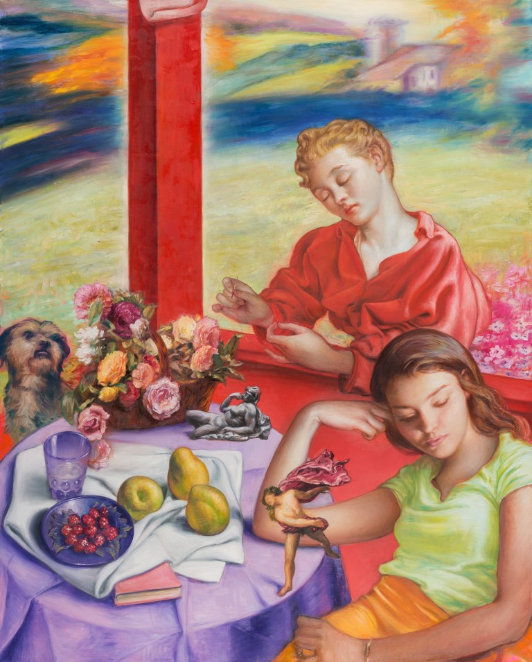
JA: Currently, I have a number of paintings in an exhibition for the month of September titled “Porch and a Vista” at Zolla Lieberman Gallery in Chicago. The show’s title and much of the work has been inspired by Pierre Bonnard’s painting “Earthly Paradise” (1916-20), located at the The Art Institute of Chicago Museum. Bonnard’s piece likely references the severe devastation of Europe following World War 1 (by way of William Morris’ epic poem) and utopian dreams.

You must be logged in to post a comment.